What Is a Font
What makes typefaces different from hand-writing, calligraphy, lettering, and logos?
The single biggest issue that makes type design different is the need for every glyph in the typeface to work with every other glyph. This often means that the design and spacing of each part of the typeface ends up being a series of careful compromises. These compromises mean that we can best think about typeface design as the creation of a wonderful collection of letters but not as a collection of wonderful letters. In other words we must think about the group and how it will perform together and prioritize this over any question of what is wonderful in a single letter.
This need to prioritize with the system rather than with any single part also leads to a need to analyze our design process on the level of the system. Characteristics which span letters become the things we want to focus on, particularly at the beginning of the design process.
The other oddity in type design is that, to a very large extent, the forms we are designing are already significantly established. Our task as type designers is not so much to create an utterly new form but rather to create a new version of an existing form. This can perplex new type designers. Finding just the right amount to change in order to excite but not to alienate a reader is a tricky thing. Often designers get stuck in letter-specific thinking. This mistake can be easily avoided if you realize from the start that what is most meaningful in a typeface are the parts of it that repeat the most. Typeface design is not just about designing the characteristics applied to the common forms we all recognize, but also to the forms that occur most often.
It is also useful to recognize that these characteristics not only help to create a font’s voice or atmosphere, but also to determine what the font will or will not be useful for, and sometimes to determine the technological contexts for which a font is suitable.
It may seem intimidating or excessively abstract to think about the design of a font in this way. However, getting used to these ideas is the key to a faster, more effective, and satisfying type design process.
Let’s begin by identifying the main systemic characteristics in type design.
Construction
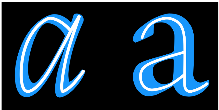
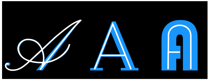
Construction refers to the structure of the underlying strokes that form a particular glyph. Perhaps you can imagine the glyph’s skeleton. The kind of construction to use is arguably one of the most important questions to think about, because the construction affects so many of the remaining choices, particularly if your design is going to feel somewhat familiar to readers. In the example above, the white lines inside the letters indicate the approximate construction suggested by the shape of the letters themselves.
However, the way strokes end (the ‘terminals’) and the ‘serifs’ (see below) are generally not part of what is meant by ‘construction.’ Construction is the skeleton of the glyph, while the rest — width, weight, terminals — are all parts of the flesh.
Proportion of X-height to Cap-height
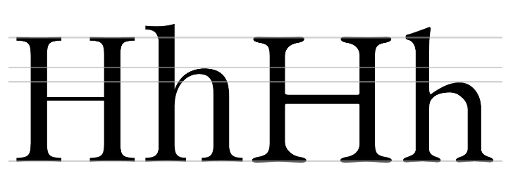
The letters on the left come from Playfair Display, which has a large x-height relative to its cap-height. The letters on the right are from EB Garamond, which has a smaller x-height. In the sample above, the size of the H has been adjusted so that they match.
